
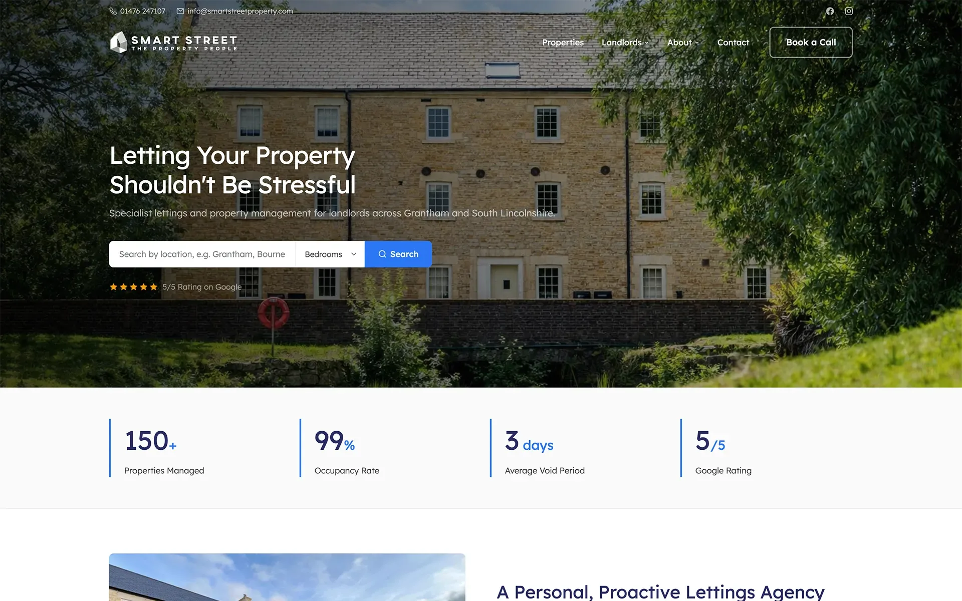
The 3 second rule in web design says a website has about three seconds to win over a visitor before they decide whether to stay or go back to Google. In practice it means two things: the page should load within three seconds, and once it does, a visitor should be able to tell what you do, whether it’s for them and what to do next, almost at a glance.
It’s a rule of thumb rather than a law of nature. Nobody switches off at exactly 3.0 seconds. But the research behind it is solid, and in our experience designing websites for small businesses, the first few seconds on a page decide more enquiries than anything further down it.
Where the 3 second rule comes from
There’s no single study called “the 3 second rule”. The idea comes from three separate findings that all point the same way.
People leave slow pages
Research published by Google found that 53% of mobile site visits were abandoned when a page took longer than three seconds to load. That figure is now several years old, and phones and networks have got faster, but expectations have risen just as quickly. It’s where the “three seconds” number comes from.
First impressions form almost instantly
A 2006 study led by Gitte Lindgaard at Carleton University in Canada found that people formed a judgement about a web page’s visual appeal within 50 milliseconds, a twentieth of a second. Their snap judgements matched the ones they gave after looking for longer. Visitors decide how a site feels before they’ve read a word.
The first few seconds carry the most risk
Microsoft Research analysed more than two billion page visits and found that people are most likely to leave a page in its first 10 to 20 seconds. If a page holds someone past that, they tend to stay much longer. Jakob Nielsen’s summary for website owners was simple: make your value clear within 10 seconds.
Put those together and you get the rule: load fast, look trustworthy straight away, and make the point before attention drifts.
Part one: load in under three seconds
If the page isn’t there, nothing else matters.
Speed is the half of the rule you can measure. Google’s own benchmark is a measure called Largest Contentful Paint (LCP): how long it takes for the main thing on the page, usually the hero image or headline, to appear. Google counts 2.5 seconds or less as good, and anything over 4 seconds as poor, measured across real visitors’ devices.
So for most sites, the honest target isn’t “under three seconds”. It’s “main content visible in under 2.5 seconds, on a phone, on an ordinary connection”.
The usual reasons a small business website misses it:
- Huge images. Photos uploaded straight from a camera or phone, often ten times bigger than they need to be.
- Page builders and heavy themes. Tools that make sites easy to assemble but load a lot of code you never use.
- Too many plugins. Each adds a little weight, and some add a lot.
- Cheap or overloaded hosting. A slow server makes every page slow, however well built.
- Autoplaying video and sliders at the top of the page.
You can check your own site with Google’s free PageSpeed Insights tool. Test the mobile result, not just desktop, and test your most important pages, not only the homepage.
Part two: make sense in three seconds
Three questions every visitor needs answered at a glance.
A fast page that doesn’t make sense still loses people. Once the page appears, a visitor is quietly asking three things:
- What is this? What does this business do?
- Is it for me? Do they work where I am, for people like me?
- What do I do next? Call, book, get a quote, buy?
If the top of the page, the part visible without scrolling, answers all three, you’ve passed. If a visitor has to scroll, read a paragraph or decode a slogan to find out, a lot of them won’t.
Compare two headlines for the same plumber:
- “Excellence in every drop.”
- “Plumbing and heating repairs in Grantham. Same-day call-outs, Gas Safe registered.”
The first is clever. The second passes the 3 second rule.
What a page that passes usually has at the top:
- A plain headline that says what you do and where.
- A short line underneath with your main reason to choose you.
- One obvious button, and a phone number you can tap on a phone.
- A real photo of your work, team or premises, rather than stock imagery.
- A quick trust signal, such as your Google review rating or an accreditation.
The 3 second test: try it on your own website
You can test your site in five minutes, and it’s more revealing than any tool.
- Find someone who doesn’t know your business well.
- Open your homepage on your phone, show them the screen for three seconds, then take it away.
- Ask them: What does this business do? Where? What would you click or tap?
If they can’t answer all three, the top of the page needs work. Do the same for your most important service page, because a lot of visitors from Google and ads never see your homepage at all.
Common ways websites fail the 3 second rule
- Sliders and carousels. Rotating banners make visitors wait for the message, and many visitors never see beyond the first slide.
- Vague slogans. “Your trusted partner for success” could describe any business in any industry.
- Pop-ups and cookie banners covering everything. If the first thing someone sees is a box to close, you’ve spent your three seconds on it.
- No phone number at the top. Especially costly for trades and local services, where a lot of visitors want to call.
- Stock photos. People recognise them instantly, and they say nothing about you.
- A cramped mobile layout. On many small business sites, most visitors are on a phone. Design for that first.
Does the 3 second rule apply to every page?
Yes. It matters most on the pages people land on first, and that isn’t always the homepage. Someone searching “roofer Sleaford” might land straight on your roofing page. Someone clicking an ad should land on a page built for that ad. Every one of those pages needs to load quickly and answer the same three questions at the top.
How we design for the first three seconds
When we design a website, we plan the top of every important page before anything else: what the headline says, what the button does, which photo goes there, and what a visitor on a phone sees first. We code our own WordPress themes rather than using page builders, which keeps pages light and fast, and we host the sites we build on servers set up for speed.
If you’d like to know how your current site does on both halves of the rule, our free website audit checks the speed, the first impression and everything below it, and tells you in plain English what to fix first.
Related reading: Website design · Website redesigns · Why is my website so slow? · Managed hosting
Sources
Checked 25 October 2026.
- Think with Google / AMP blog: New industry benchmarks for mobile page speed (53% of mobile visits abandoned after 3 seconds)
- Nature: Web users judge sites in the blink of an eye (Lindgaard et al., 2006)
- Nielsen Norman Group: How long do users stay on web pages?
- web.dev: Largest Contentful Paint (LCP)
- Google PageSpeed Insights